Click any image to view it in full size.
This case study will analyze in detail and aim to improve the user experience that Shopee buyers have when using the app to find and choose products.
Click any image to view it in full size.
Analyzing the current UX issues of the Shopee shopping experience, focusing specifically on finding and choosing products.
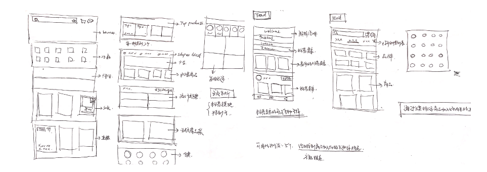
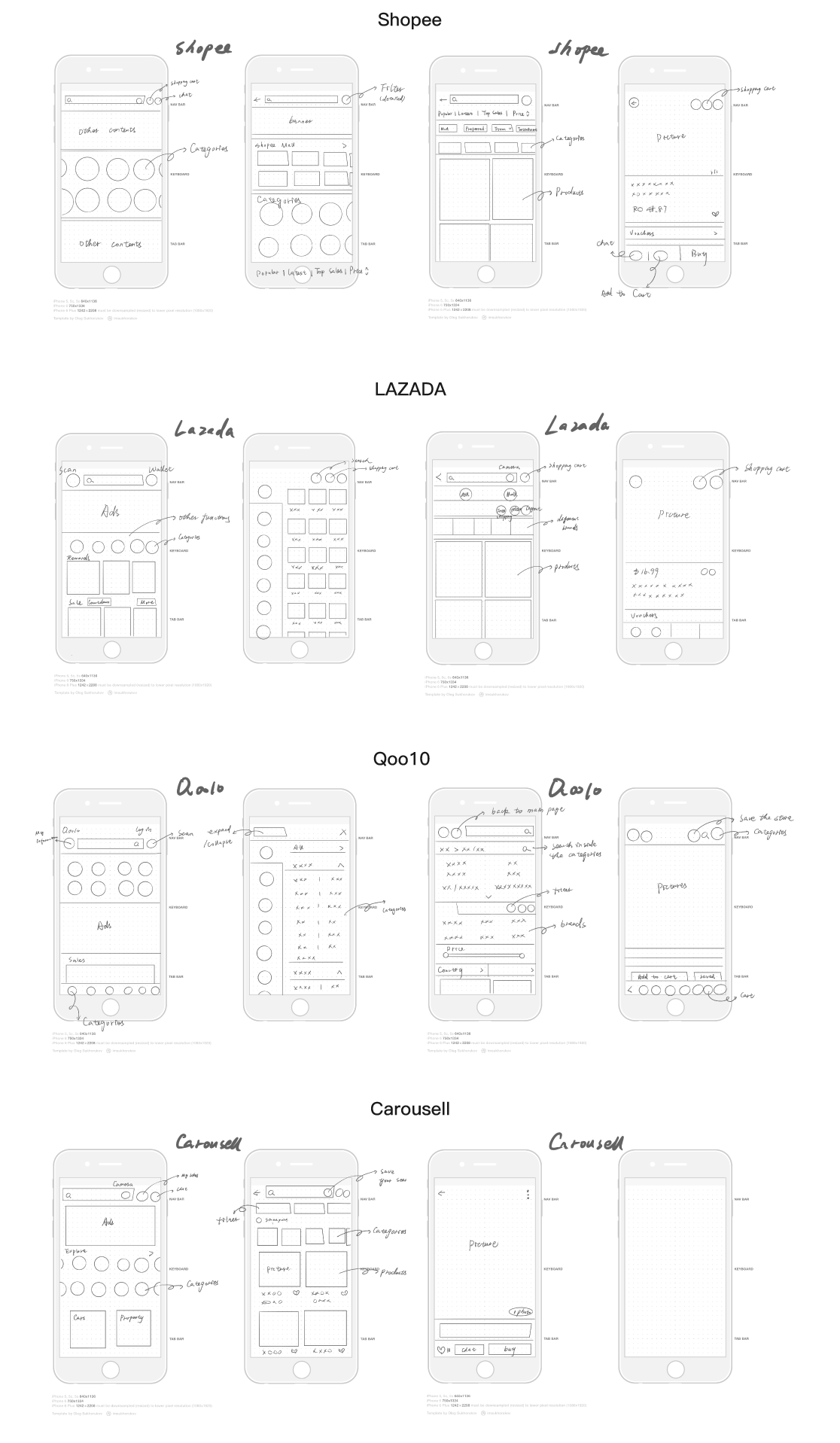
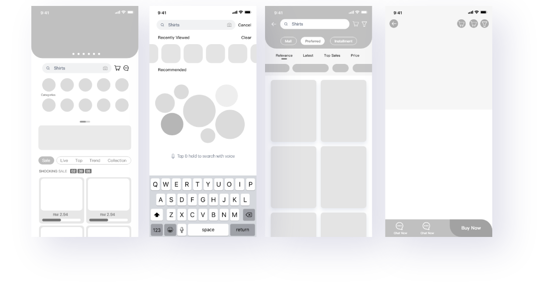
In order to find UX issues of the shopping experience, I drew a wireframe to understand each part of the APP, focusing heavily on Finding and Choosing products.
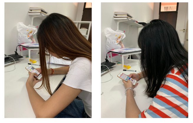
Testing usability across Shopee, Lazada, and Qoo10 with real users performing identical tasks.
"Now you are gonna buy a gift for your friend's cat, but you are not familiar with pet stuff. How would you learn different products for pets? Try to choose a gift in such a situation."
I invited 2 users and ask them to finish the task in 3 Apps. They spoke loudly of what they were thinking during the test. I observed their operations and asked how they felt after the test.
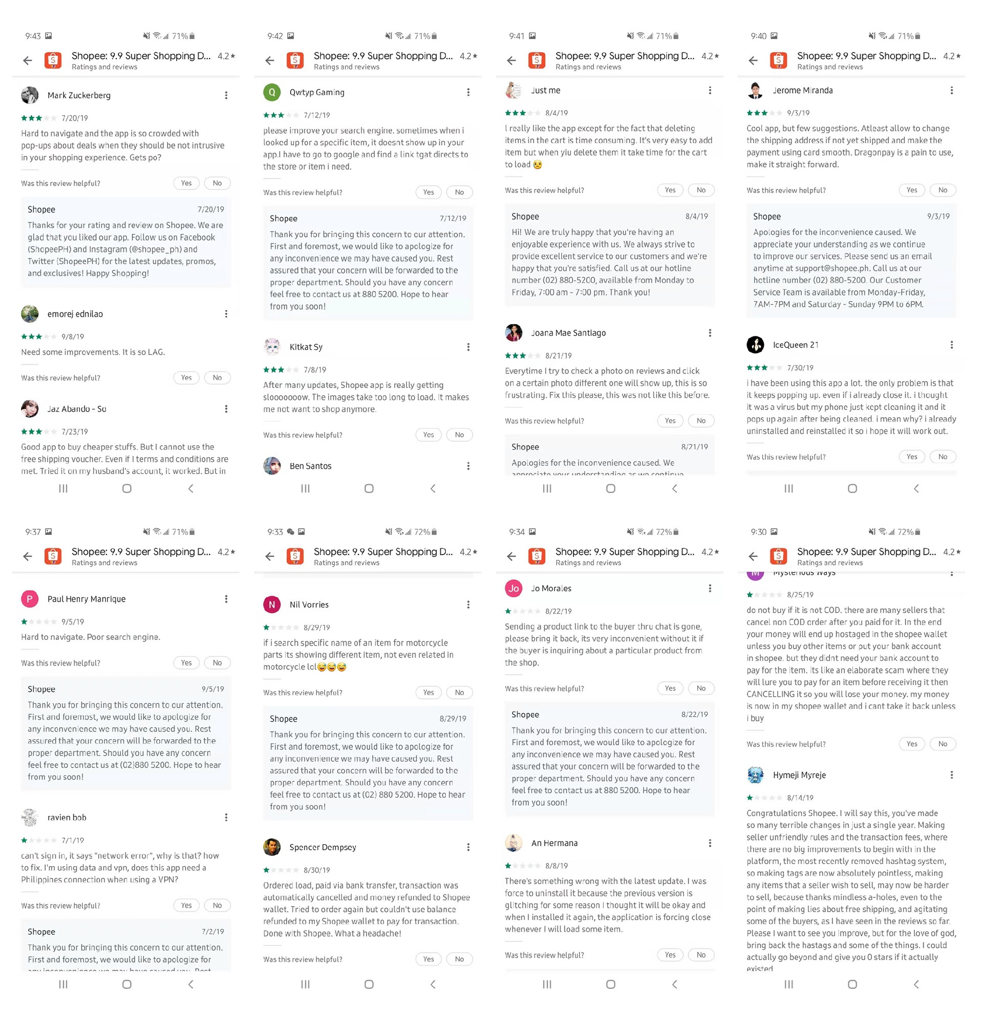
Reviewing user comments online and comparing Shopee against other dominant e-commerce platforms in Southeast Asia.
I tried to search for comments from users. Many users are complaining about the search engine and the system of Shopee. I try to find the complaints that I can improve through design: Hard to navigate and Crowded with pop-ups about deals.
After searching information about Southeast Asian e-commerce, I found that Shopee, Lazada, Carousell, ZALORA, and Qoo10 are popular. In order to understand the user flow of finding and choosing products in different apps, I drew wireframes of each app to analyze.
How might we improve the user experience when using the app to find and choose products?
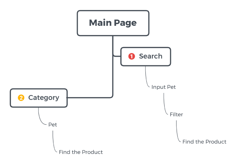
There are 2 distinct paths to finish the task mentioned before (searching versus categorizing).
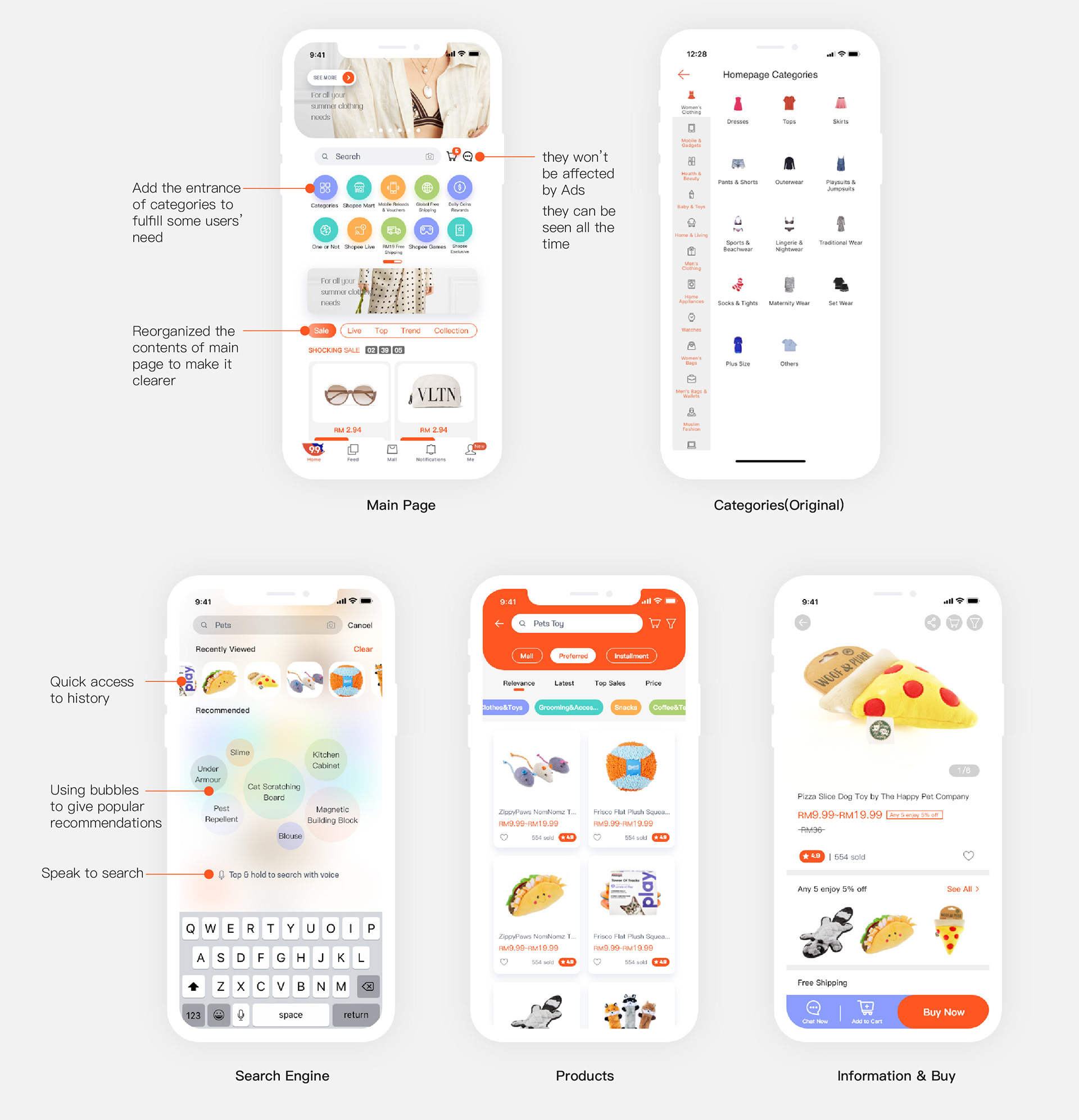
According to the flows, I developed the improved wireframe structure.
The final high-fidelity screens presenting a cleaner, more navigable interface for Shopee users to discover and purchase products.